

Ranking OHL Jerseys From Worst to Best

In this article, we will rank each of the 20 OHL teams’ jerseys from worst to best. These are special jerseys, since the CHL is often a player’s first taste of semi-professional hockey.
20. Kitchener Rangers

Strictly from an appearance standpoint, this is a good jersey. But there is one problem that makes this jersey last in our rankings – it’s identical to the New York Rangers’ jersey. This is actually because the two clubs were once affiliates. But people might see this jersey and think it’s the New York Rangers and not the Kitchener Rangers. It has almost no originality, which makes it last in our rankings.
19. Peterborough Petes

The Peterborough Petes are also one of the oldest OHL clubs, and have dressed themselves in maroon and white jerseys since the 1950s. Unfortunately, The colors aren’t visually appealing, and the striping isn’t great. The thick white stripe surrounded by two thinner stripes going all the way down the arms is awkward, as is the white up the sides of the jerseys.
18. Mississauga Steelheads

Although there are a handful of OHL teams within a 100-mile radius of Toronto, the Mississauga Steelheads are the only one sporting the Maple Leafs‘ colors. There is nothing particularly bad about the jersey, as the logo fits nicely and the blue and white work well together. However, it is a very boring jersey without any eye-catching features.
17. Windsor Spitfires

The Windsor Spitfires have arguably the coolest logo in all of the OHL. You can’t go wrong with a colorway of navy blue, red, and white, but he placement of the red is very odd. It traverses between the neck and the shoulders, under the arm pit and down the sleeves. It looks very weird, and changing it could go a long way.
16. Sault Ste. Marie Greyhounds

Playing just north of the Michigan-Ontario border, the Sault Ste. Marie (Soo) Greyhounds wear the same jersey pattern as the Detroit Red Wings. The reason for this jersey’s bad ranking is the lack of anything interesting. Red and white works fine, but there is one simple white stripe and the logo doesn’t have much to it. The stars above the logo are a good touch.
15. Owen Sound Attack

The Owen Sound Attack have worn red as their primary color since their 2011 rebrand. The new jerseys are much simpler than the previous ones. There’s nothing bad about this jersey, but there are things that could be better. For example, the shade of red looks off, the thin black stripe at the top isn’t necessary and the yellow in the logo isn’t in the jersey at all. Still, not a particularly off-putting jersey.
14. Flint Firebirds

The Flint Firebirds became the OHL’s newest franchise when the Plymouth Whalers moved north to Flint, Michigan, in 2015. Since then, they have worn these navy blue, orange and silver jerseys. The colors mesh well, and the logo is very cool, but the odd positioning of the orange and silver push this jersey down the rankings.
13. Barrie Colts

The Barrie Colts logo has never changed since their founding 25 years ago, and they only had one jersey redesign in 2009. The Colts have always worn navy blue, yellow, red and white. The jersey isn’t bad, but the yellow stripe down the sides and having no striping at the bottom prevents it from being anything special.
12. Guelph Storm

The Storm altered their logo a handful of times in their history, but have sported crimson, silver, black and white since the 90s. The Storm’s jerseys aren’t at all bad, but there are definitely a handful that are better. It’s also very similar to the Owen Sound Attack uniforms, so we ranked them similarly.
11. Hamilton Bulldogs

The Hamilton Bulldogs were the other new team in 2015, when the Belleville Bulls moved to Hamilton and became the Bulldogs. After one season wearing the blue and red they used to wear in Belleville, they switched to black and yellow to match the Canadian Football League’s Hamilton Tiger-Cats. They lose some creativity points for plagiarizing the Pittsburgh Penguins, but it still looks really good with their own logo.
10. Sarnia Sting

The Sarnia Sting recently had a jersey redesign, one of multiple in their history. But the team always rocked black, yellow and white. The recent design is a simpler one than those worn previously, but sometimes simplicity can be an improvement. The big white stripe with two surrounding yellow stripes looks really nice, as does this big bee logo in the center.
9. Saginaw Spirit

Since the Saginaw Spirit started playing in 2002, they’ve hardly changed their jersey. They always wore navy blue, red and white, including an American flag in their logo as they are one of just three OHL teams in the United States. The striping is very simple yet clean, and their logo is one of the coolest.
8. Niagara Ice Dogs

The Niagara Ice Dogs, who play in Niagara Falls, Ontario, have never worn anything besides black, red and white. The striping has changed quite a bit over the years, but their well-known hockey playing dog has always centered the jersey. The two red stripes and one white stripe pop off the black jersey, and it looks very clean.
7. Kingston Frontenacs

The Kingston Frontenacs have a jersey that some people love and some people hate. They’ve always sported black, yellow and white, but changed everything in 2012. The yellow runs throughout the top and the sleeves, with white and black stripes down the sides. It actually looks cool, and could be better if the logo was more interesting than a “K.”
6. Sudbury Wolves

The Sudbury Wolves changed their jersey many times throughout their history, including changing the main color from green to blue in 1989. The current jersey may the best of the bunch. The blue, silver and white all play off each other beautifully. Every aspect of the jersey pops and looks even cleaner on ice.
5. Oshawa Generals

The OHL team with the most championships have had tons of different logos, and therefore tons of different jerseys. But for a long time, the Generals have worn this same design featuring white and navy stripes on a light red base. They have an iconic five-stripe design, with three stripes in white and two in blue.
4. North Bay Battalion
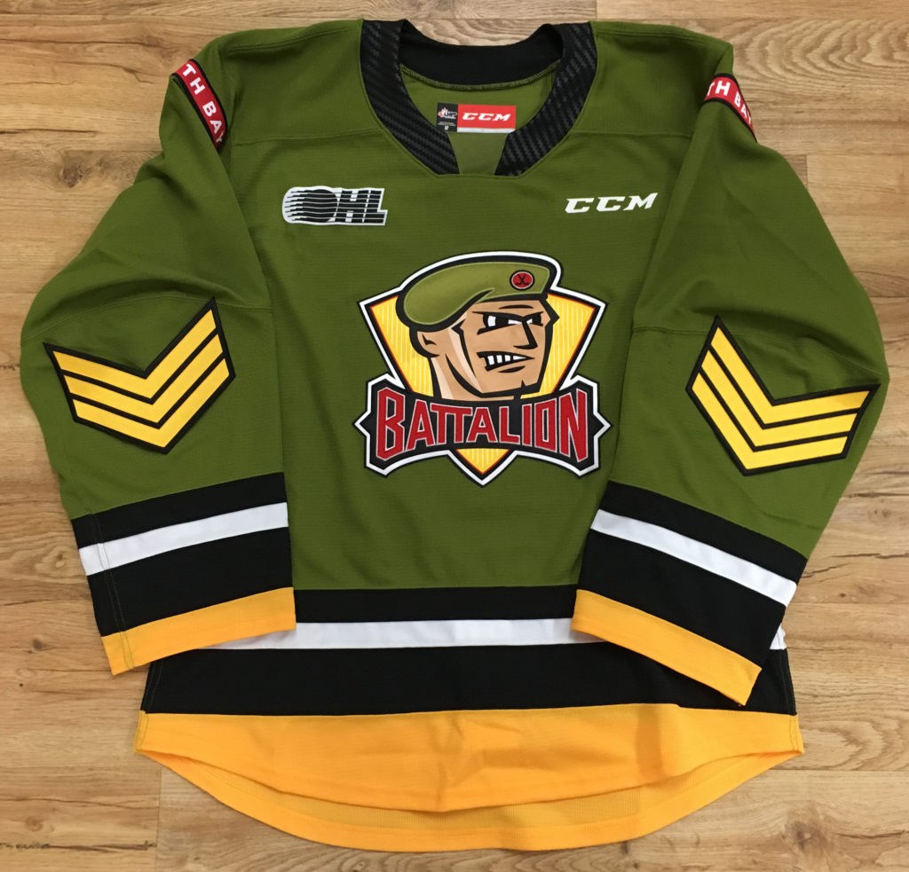
This is another love-or-hate jersey with an array of positive and negative reactions from fans. They unveiled the army-like pea green jerseys in 1998, and the jersey hasn’t changed since. Although very uncommon for a sports team, the pea green, yellow, black, and white jerseys stand out and look very nice.
3. Erie Otters

The Erie Otters have always worn navy, yellow, red and white, like the Barrie Colts, but recently decided to remove the red. That was probably the right call, as their navy and yellow jerseys are the best they’ve ever had. The logo is very cool, and the colors make the jersey one of the best in the league.
2. Ottawa 67’s

The 67’s have had some jersey changes, but ultimately went back to their jersey that they first unveiled in 1967 in honor of the original Ottawa Senators. Red, black and white is a very common color scheme in the OHL, but the 67’s style of it is the coolest. You can’t go wrong with the three-color striped jerseys.
1. London Knights

Arguably the most well known OHL franchise, the London Knights have had tons of different jerseys. But, they have constantly changed their incorporations of green, yellow, black and white. Recently, they unveiled new jerseys with a cleaner logo and three thick stripes of each color. The jerseys stand out, the colors are amazing, and are the best jerseys in the OHL.
Die-Hard Islanders fan and writer from Plainview, Long Island, NY. I have a passion and knowledge for this team and I enjoy sharing that with others
