

NHL Throwback Jerseys That Should Return – Metropolitan Edition

Over the past two seasons, teams have begun to expand their uniform lineup to include NHL throwback jerseys for two or three games a year. The trend started back in 2017 with the Toronto Maple Leafs donning the vintage St. Pats logo from 1919 to celebrate St. Patricks Day. The tradition stopped for a year with the change of the jersey rights from Reebok to Adidas, but the idea was picked right back up by some teams a year after the change. The Carolina Hurricanes donned the Hartford Whalers green for a game against the Boston Bruins in December 2018, and the aforementioned Leafs brought back the St. Pats uniforms for 2 games on St. Patricks day weekend last season.

With the success of the first two retro jerseys, more teams followed suit and made their own in 2019. Before the season began, the St. Louis Blues unveiled a new throwback based on the so-called “Clown Jerseys” of the 90’s for 3 games, the Los Angeles Kings made a 90’s throwback of their own that was to be worn twice, once against the Colorado Avalanche and once against the Ducks in a game that was postponed by the Coronavirus, and the New Jersey Devils made a white jersey with red and green as secondary colors as a throwback to their beginnings in New Jersey.

Also, in honor of their 50th anniversary, the Vancouver Canucks surveyed fans on what NHL throwback jersey they should bring back for a few games this season, and that survey brought the return of the Flying Skate jersey.

With the emergence of this trend, a report has come out from NHL jersey forum Icethetics that a new “fourth jersey” series will be unveiled for several teams for next season. As a jersey enthusiast myself, I am really excited for this possible development and what this could become. With this speculation emerging, this will be the first entry in a series of articles that will predict what previous look teams will bring back under this new proposed system.
All prior third jerseys and full time logos will be in consideration for this list, as well as special event NHL throwback jerseys from outdoor games. However, the Vegas Golden Knights will not receive an entry because they are the only team in the league with 2 jerseys only. This first article will be focused on the Metropolitan Division where predictions for its 8 teams will be placed. This will be followed by the Atlantic, Central, and then Pacific Divisions and their probable throwbacks, so stay tuned for further entries!

Carolina Hurricanes-Whalers

When it was announced that the Canes would be bringing back the Whalers jerseys against Boston Bruins, their old arch rivals, for a game in 2018, it was a weird but welcome decision. To see the young Carolina stars wearing the uniforms of the team’s roots for a game would be cool to watch. When the decision was made, Carolina created an entire night surrounding it, bringing in old mascot Pucky the Whale, inviting former Whaler Mike Rogers to meet fans and drop the ceremonial puck, and playing the hit hockey song “Brass Bonanza” when the Hurricanes scored.
The night was a success as the Hurricanes won the game 5-3, and not only did Carolina bring back the uniforms for another game the next season, but they also wore them in Boston later in the year. It was fun to watch on television, and it should be used for more than one game in my opinion. Not only for the jersey, but who doesn’t want to hear Brass Bonanza more often?!
Columbus Blue Jackets-The Star and Stick

This logo is the one the Blue Jackets came into the league with before rebranding to their current design today. At first the logo doesn’t look like much, just a red ribbon surrounding a hockey stick with a star on top. However, when you look deeper into the logo, there is further meaning involved. The ribbon spells out “C-B” and the hockey stick makes a “J” to spell out the initials used for the team.
While it is not the most visually appealing logo of all time and is the only other option besides the logo of today, it would make for an interesting throwback if used properly. It could possibly be similar to the one pictured above, or it could be a navy blue base, white shoulders, and red stripes or sleeves down the arms. There are lots of ways this could go if the Jackets decide to go this route on a possible throwback, and this would be the perfect time for it with next season being their 20th anniversary.
New Jersey Devils-Red and Green

While the Devils are similar to the Hurricanes in that they have roots in different cities, it’s different to Hartford as the Whalers were relatively successful and a long term option in their time up north. The Devils’ past as the old Colorado Rockies and Kansas City Scouts was relatively forgettable with no major stars and relatively short stints in each city, and Colorado now has a very successful franchise in the Avalanche.
For this pick, the Devils will go back to their old red and green color scheme that the team wore in its early days from 1982-95. However, this could likely be the look as the source stated that this uniform could be revived with green as the primary color instead of red or the aforementioned white.
New York Islanders-Fishsticks

The Islanders’ Fisherman uniform is a hotly debated topic on social media. Some fans love the uniform and hope that it’s brought back, but others hate it and wish to forget the jersey and the era that it is related with. While, yes, the Fisherman logo is associated with some of the worst days and moments in Islanders history, today it holds a nice little bit of nostalgia to fans.
The logo is always thrown around in “best retro jersey” conversations today and with how past uniforms are returning it makes sense. The team is also constantly making wallpapers, hats, and other merchandise with that look as the main theme, so today’s marketing does indeed embrace that era. With the Isles’ true final run at the Coliseum upcoming, it would be a good idea to don the fisherman at the Old Barn once or for a few select games before the team moves to Belmont.
New York Rangers-Statue of Liberty

Even if this is a website dedicated to the Islanders, it can be said that the Statue of Liberty jersey is a very good look for the Rangers that was used from the late 90s to mid 2000s. With the Blueshirts playing in New York City, this is a very easy connection to make with the team and location, and the Statue of Liberty logo works well with the navy blue base color and red background and font.
If the team was to bring this look back, it would be cool to see them add a few more stripes or a different color to the shoulders since the predominantly blue scheme can feel too basic sometimes. Add some white shoulders and white and red stripes at the bottom, and the Rangers would look great rocking these at Madison Square Garden.
Philadelphia Flyers-2012 Winter Classic

The Flyers are a tricky team to pick for since they’ve stuck with the same logo for their entire existence. However, the best play on it besides their current uniforms has to go the one that they wore in the Winter Classic at Citizens Bank Park. The use of a cream color as an off-white instead of a solid white adds an interesting look to the current logo, and the jersey provides a very good balance of the primary orange and the complementing black and cream.
The team stuck with this jersey as their third for a few years before scrapping this in favor of the all black alternate from the Stadium Series they wear today in 2018. However, if the Flyers buy into the new jersey program, some consideration should be given to the Classic jersey since it is one of the best they had in recent memory.
Pittsburgh Penguins-2008 Winter Classic
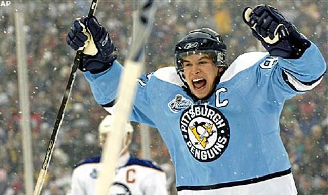
While the baby blue color may be an odd choice at first for the Penguins, it does actually make sense. Believe it or not, the Penguins had their start with powder blue and white as their color scheme over 50 years ago before changing to black and gold in the 80s.
While this choice may not harken back to the glory days of the Penguins with Mario Lemieux and Jaromir Jagr, it would still be a cool touch for them to honor their roots with powder blue as the base color. Also, using the crest from the Winter Classic uniform would be a nice call back to the days when Crosby was still a young star in the league and the inaugural Winter Classic in Buffalo.
Washington Capitals-Screaming Eagle

This entry follows some similar supporting evidence that the Penguins had in their entry. While this uniform may not contain the original colors of the team, it does harken back to the days of some of their best players. Peter Bondra, Dale Hunter, and Michal Pivonka all played for the Capitals in that era, and the team made their first Stanley Cup Final in that uniform. Alex Ovechkin also wore that jersey at the start of his decorated NHL career, so it does relate to the current roster to some extent.
While no one knows how long The Great 8 will play after this season, it would be fun to see him and the Caps don the uniform he began his career in for a few games until his career is over. Not to mention, to have Evgeny Kuznetsov do the bird flap in the eagle jersey would be perfect if we’re being honest with ourselves.
So that wraps up the first entry of the series. If you think of a jersey I might’ve missed, leave a comment on this post and tell us which one was missing. The next edition of the series will cover the Atlantic Division, so stay tuned for more!
I am a first year student at Hofstra University and an avid Islanders fan. I have been writing for Drive4Five since March 2020. My family has been season ticket holders for the team since 2016, and hockey is my favorite sport. As I expand my knowledge in the field of Journalism, I am writing to express my love for the Islanders and the NHL.

4 thoughts on “NHL Throwback Jerseys That Should Return – Metropolitan Edition”